
Josef Muller Brockmann was born in Switzerland in 1914. He is considered to be a central figure when it comes to the Swiss modernist graphic design. He is known for the sans-serif typography and objective photography.
Primarily, Josef Muller Brockmann studied design, architecture and history of art. Eventually he was taught in Zurich and at the age of 20, in 1934 he started working as a freelance designer. In 1936, his very own studio was opened in Zurich as well in which he specialised in graphics. Between 1942 and 1958, he created a number of theatre sets in Zurich, Copenhagen and Munich.
Primarily, Josef Muller Brockmann studied design, architecture and history of art. Eventually he was taught in Zurich and at the age of 20, in 1934 he started working as a freelance designer. In 1936, his very own studio was opened in Zurich as well in which he specialised in graphics. Between 1942 and 1958, he created a number of theatre sets in Zurich, Copenhagen and Munich.
His modular grid involved 8-32 units offers numerous solutions and a high amount of flexibility in the design. Such a grid is used on an international level when it comes to graphic and design industry. He also wrote "The Graphic Artist and His Design Problems" in 1960 and 3 other books until 1981. In 1966, he was appointed as a European design consultant for IBM. He continued working until he passed away in 1996.

Josef Muller Brachmann's work:


Beazley, M., Aynsley, J., eds., 2004. Pioneers of Modern Graphic Design: A Complete History. London: Octopus Publishing Group Ltd.

With his first book, published by Arthur Niggli of Switzerland, Josef Muller Brockmann became one of the most influential commentators on the move of graphic design from print media to systems design in the form of corporate identity and environmental design.

Poster which its headline is "Weniger Larm" meaning Less Noise done in 1960. For a Swiss public-awareness campaign to prevent road accidents and encourage greater awareness of the risks of motor traffic, Muller-Brockmann developed a series of objective photographic posters overlaid with direct typographic messages. Such headline is in bright red colour that seems to complement the rest of the poster (preventing danger of some sort of alert).

One of a series of poster named "Musica Viva" done in 1958 designed for the Tonhalle in Zurich. Such design uses abstract motif to interpret the style of music it advertises. Like Max Bill which also was a Swiss modernist graphic designer, before him, Muller Brockmann choses minimum means to achieve maximum expression.

The above poster was for the Zurich Town Hall done in 1955 is perhaps Muller Brockmann's most recognised piece of work. Such poster is well organised by making use of the grid system to prevent confusion, apart from that, when it comes to the colour, black seems keep neatness to the layout. Muller Brockmann also created a circular movement by using bended rectangles with different sizes in this poster.
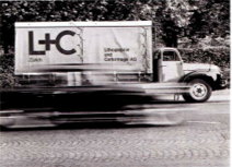
Under the trademark "L+C", Muller Brockmann created a corporate identity for the packaging and printing company Lithographie und Cartonnage AG of Zurich in 1954. The design programme covered all the firm's products and services.
Reference
Beazley, M., Aynsley, J., eds., 2004. Pioneers of Modern Graphic Design: A Complete History. London: Octopus Publishing Group Ltd.
No comments:
Post a Comment