 Fortunato Depero’s works features for the first time a mechanical binding consisting of two metal bolts holding the pages together. This book is considered to be a masterpiece in the history of printing. Using Sans Serif as a font, the artist seems to give priority to the typography being used. Furthermore, the artist does not seem to stick to the rules of the grid technique: the letters do not seem to be uniform.
Using just two flat colours and the boldness for the typography, this artwork left an impact because it was an innovation for the time being.
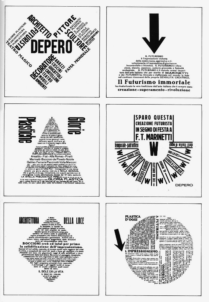
However, this innovation was not just for the cover. The text inside this work-of-art presents a variety of typographic inventions including the use of different typefaces, the text formed into various geometrical shapes, the use of variety of different papers and colours, and several other devices. For such layouts, the artist uses the grid technique (unlike the front cover of the book in which he does not seem to use such technique).

In this layout, the designer seems to go against the classic and traditional art and structural techniques. First of all, he presents a variety of portrait and landscape text pieces. The main title of the design is not centered and there he does not seem to give it importance. The arrow in the middle of the layout might mislead the reader. There is also the addition of a new bold and rather bright colour. Another technique which was not so common is, the one where a text-piece is placed on other text. At the same time, such a text-piece is still readable. Such innovations are eye-catching even though they seemed strange to his contemporaries.
Reference
Maurizio Scudiero,1909. The Italian Futurist Book. [online] Available at: <http://www.colophon.com/gallery/futurism/1.html> [Accessed November 2013].
No comments:
Post a Comment