
Alexander Rodchenko, born in St Petersburg Russia in 1891, was a designer who involved painting, photography and sculpture in a number of works. His career started with paintng and later on, he experimented with photography and photo-montage. Rodchenko's works revolve around advertising, packaging, logos and posters for the Russian airlinany, Dobrolet; bookmarks, book covers, illustrations and photomontage and he even designed a number of costumes for different Russian theatres .
Rodchenko was a member of the Productivists, a group which gave importance art into every day life. Additionally, he is considered to be a leading figure when it comes to Russian constructivism (influenced by the Russian revolution of 1917). In 1921, Rodchenko declared "The End of Painting" by exhibiting three solid monochromatic canvases in red, yellow and blue hues. Furthermore, he logically concluded that there was no reason to continue exploring this medium. Eventually this was the beginning of new ways to approach art. Rodchenko's work influenced many designers from the early 20th century.
From the 1930's onwards, Rodchenko worked as a typographer and photo journalist with magazines like for instance, USSR in Construction.
Alexander Rodchenko's work:
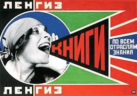
This is perhaps one of the most famous photomontage that Rodchenko did in 1924, for a Moscow publisher in which Lilya Brik, the muse of the poet Vladimir Mayakovsky, joyously cries out 'books'. As said before, photograph is implied, which also typography is used to compliments the rest of the poster. Such flat colours are used, which in my opinion appear to standout to convey the massage said.
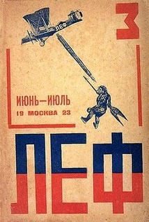
This cover for the third number of Lef, the magazine of the Left Font of the Arts accomplished in 1923, shows Rodchenko's use of elementary typography. In this typeface, a simplified version of the Cyrillic alphabet, the upturned "M" serves as a number "3". The photomontage conveys a narrative through the use of emblematic images. Two colours (blue and red) are implied to this poster which creates contrast.

This is an advertisement for Trekgrne beer meaning Three peaks beer, published in 1925. In this image one can notice that such poster is designed in a a asymmetrical form with bright colours involved.

This is a cover for a magazine called Kino Glaz meaning Cinema Eye completed in 1924. Rodchenko alerts the reader to the construction of the cinematic process. The staring eye is a self-reflexive motif that draws attention to the act of seeing in viewing through a camera lens, watching a film and reading a poster.

A Design for the Lenin Corner in the USSR Workers' Club (Robochii club SSSR) at the Exposition Internationale des Art Decoratifs et Industriels Modernes, in Paris during 1925. It has very minimum of colour used and also geometrical shapes are involved in such design.

Maquette for "Was of the Future (Voina budeshchego)" magazine illustration, 1930. Here in this magazine page one can notice that photomontage is implied by using paper cutouts of high buildings, explosions, aeroscraft (air transportation) and human figures, all in a perspective views.
This video clip shows and talks about Alexander Rodchenko and the Russian Avant-garde:
Reference
Beazley, M., Aynsley, J., eds., 2004. Pioneers of Modern Graphic Design: A Complete History. London: Octopus Publishing Group Ltd.
Dominic Flask, 2009. Alexander Rodchenko. [online] Available at: <http://www.designishistory. com/1920/aleksander-rodchenko/> [Accessed December 2013].
No comments:
Post a Comment