 Weingart is a typographer, graphic designer and an influential teacher who was highly influential in the Post-Modernism era. In the 1960's, he challenged the order, rules and principles of the International Typographic Style. His experiments appeared in a number of coved designed and posters. In such designs he used wide letterspacing and wordspacing, unexpected arrangement of letterforms, contrasts of type weight and step rules amongst other techniques. Later on, in the 1970's he started to explore the graphic imagery which was developed through photolithography. His techniques provided a rather positive alternative to the principles of the Swiss design.
-- http://bcove.me/wcfrfu0x

"18th Didacta/Eurodidac" Worldformat poster for the convention on teaching aids, film layering, 1980/81
In this image shows a combination of images (cutouts sort off) and a number of geometrical shapes in a grayscale background together with shade of yellow, orange and red. The designer made also use of capital letters sans serif font throughout the title and the lines in the title seem to give it more importance.
In this image shows a combination of images (cutouts sort off) and a number of geometrical shapes in a grayscale background together with shade of yellow, orange and red. The designer made also use of capital letters sans serif font throughout the title and the lines in the title seem to give it more importance.
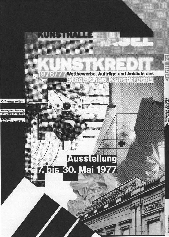
"Kunstkredit Basel 1976/77" Worldformatposter for Kunsthalle Basel, film layering, 1977
In this image one can see that such image is in a grayscale tones and also have a photomontage look. Their is a also the use of typography, with different variety of font sizes all in sans serif style.

"Kunstkredit Basel 1980/81," Worldformatposter for Kunsthalle Basel, 1981
Once again, the designer made use of bold suns serif fonts with different sizes. It seems that their is used some sort of the grid system together with geometrical shapes and shades of bright colours. It is also asymmetrical layout in a simplicity way, at the same time there is a "modern" look to it.
Reference
Livingston, A. I., 2003. Graphic Design and Designers. London: The Thames & Hudson.
No comments:
Post a Comment