Saturday, 3 August 2013

Psychedelia 1960- 1975

The Psychedelic movement started in the mid 1960's, a time in which many controversial issues were raised, from civil rights issues to spiritual experiences. Such a movement effected a number of aspects of popular culture including music, language, art, philosophy, fashion and also literature. 

The word "psychedelic" comes from the popular drug amongst the youth culture of that time which made individuals distorted of awareness and unconscious. Furthermore, when it comes to the posters of the rock genre, they tried to communicate this psychedelic experience. 

Psychedlic art included a combination of Op Art, illegible and hand-written types, shapes inspired from Art Nouveau and vibrant colours used which were mainly inspired from the Pop Art movement. 

Most of well known designers of such a movement were many times self taught. These included Victor Moscoso, Peter Max and Wes Wilson.


Victor Moscoso's work:


Peter Max's work:


Wes Wilson's work:


Reference

Livingston, A. I., 2003. Graphic Design and Designers. London: The Thames & Hudson.

Essay (attempt no 2)

In different eras, designs of different designers were suited to the culture of their time, sometimes affecting also the society or culture in which they emerged. Furthermore, such influences, by using a number of different materials and techniques changed the attitude towards design and culture.
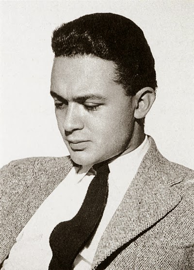
Paul Rand
Paul Rand is one of the most famous graphic designers in the world. Paul Rand was the key figure within the New York School Movement. Such movement which started from the 1940's was distinguished from other styles of the same era. It was applied by American designers whose works involved a number of economic and cultural aspects. Paul Rand introduced modern art into industries which were considered to be larger than others. Within such industries Rand designed a variety of posters and corporate identities. Rand gained popularity and changed our industry by struggling against everything he knew. For instance one of the most memorable corporate identities is his IBM logo which was slightly changed in 1960. Rand's abilities stood out as he was able emphasise the importance of this corporate brand. Rand not only changed the way how design was accomplished and respected, he also changed the way by which businesses saw the need for design and branding. Rand experimented with the introduction of themes (which were normally found in fine arts) into his graphic work which eventually formed new ways of looking at graphic design: graphic design was no longer seen as an art that simply filled a page. 
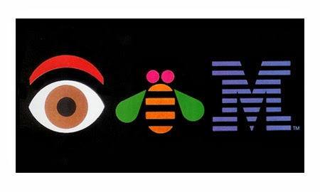
IBM logo done by Paul Rand

Josef Muller-Brockmann
In Switzerland, after the Second World War (in the 1950's) the Swiss Style which is also known as the International Typographic Style emerged. Techniques involving uniformity, geometry, the use of negative space, the use of the grid system and the sans-serif type were developed. The international popularity of such designs were even enlarged further in the 1960's and 1970's with artists like Josef Muller-Brockmann who was the founder and editor of the Zurich published journal Neue Grafik (which introduced the Swiss Style into America). Muller-Brockmann was highly influenced by Constructivism and his works involved a mathematical harmony of a number of formal elements. Muller-Brockmann's works involved a series of concert posters, powerful public health and safety posters (most of the time using the photo-montage technique) and also the creation of theatre sets in Zurich. Together with other artists, Josef Muller-Brockmann saw design as part of the industrial production and searched for anonymous, neutral and visual communication. That's why, amongst other techniques Muller-Brockmann chose photographic images rather than illustrations, and typefaces that were industrial looking rather than those designed for books as his main techniques. Josef Muller-Brockmann and other contemporary designers believed that their role and works will eventually develop them into visual communicators rather than simply artists. Furthermore, simplicity was much more powerful than a mixture of elements, a technique which is still preferred by a number of designers. In addition, a simple layout is immediately understood by those with different languages and cultures especially when it comes to the web. Muller-Brockmann’s intention when it comes to the designs of the 1950s was to create posters that communicated with a large number of people. 
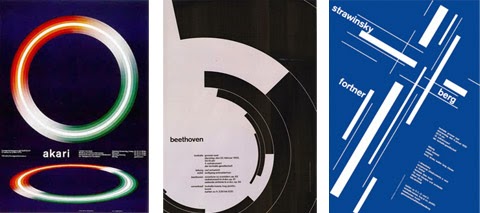
Posters done by Josef Muller-Brockmann  
Paul Rand and Josef Muller-Brockmann are two key figures in different eras whose works and designs were suited to the culture of their time. Their works left an impact not only in the societies in which they worked – they gained popularity on an international level. Furthermore, their ideas and education still apply today so much so that many contemporary artists incorporate such techniques in their own works.


Reference

Speider Schneider, 2011. Paul Rand will change your life!. [online] Available at: <http://www.
noupe.com/inspiration/paul-rand-will-change-your-life.html.> [Accessed January 2014].

Nora Reed, 2010. Paul Rand - Corporate Identity Designs, Innovation and Excellence. [online] Available at: <http://www.logoblog.org/wordpress/paul-rand/> [Accessed January 2014].

Novin, G., 2012. A History of Graphic Design. Chapter 42; The Swiss Grid System -- and the Dutch Total Grid, [blog] 10th November. Available at: <http://guity-novin.blogspot.com/ 2011/07/chapter-42-swiss-grade-style-and-dutch.html> [Accessed January 2014].

Stefan Sagmeister

Stefan Sagmeister was born in Austria in 1962. After studying in Vienna, in 1985 he won a scholarship to the Pratt Institute which is in New York. Sagmeister collaborated with Leo Burnett and later with Tibor Kalman after which he established his own studio in New York (1993) Sagmeister Inc. Sagmeister is known for his CD cover designs for the music industry which were considered to be precise, at times rebellious. Some of his clients are the Rolling Stones, Pat Metheny and David Byrne. 

The Happy Show was Sagmeister's first museum show which was held (2012-2013) in the United States. It presented works from various artistic sectors which included info graphics, film, sculpture, print and interactive installations.


Video: Stefan Sagmeister

-- http://bcove.me/uopciids


In this image, one can se that the designer make use of photography. There is also a combination of the agricultural theme with the variety of fonts used. Such fonts are mainly placed on one part of the whole design. The largest title "HURRY!"is of the same colour of the chicken's leg (infect the letter 'Y' found in the title is very similar to the chicken legs).  


Like the image discussed before, here we find a combination of photography and typography with different fonts and sizes created. Their is also a synchronisation between the photos and the first and last letter of the title: while one tongue is part of the letter  'F', the other tongue is part of the letter 'E', having said that the side borders of the main title are developed from the first and the last letter itself.


Although in this image, the item presented is 3D, the chair is built after joining together a number of typographic fonts which is very interesting. The structure of such chair is primarily traditional which can be easily noticed from the material used (cane).


Reference

Livingston, A. I., 2003. Graphic Design and Designers. London: The Thames & Hudson.

Wolfgang Weingart

Weingart is a typographer, graphic designer and an influential teacher who was highly influential in the Post-Modernism era. In the 1960's, he challenged the order, rules and principles of the International Typographic Style. His experiments appeared in a number of coved designed and posters. In such designs he used wide letterspacing and wordspacing, unexpected arrangement of letterforms, contrasts of type weight and step rules amongst other techniques.  Later on, in the 1970's he started to explore the graphic imagery which was developed  through photolithography. His techniques provided a rather positive alternative to the principles of the Swiss design. 

Video: Wolfgang Weingart 
-- http://bcove.me/wcfrfu0x

"18th Didacta/Eurodidac" Worldformat poster for the convention on teaching aids, film layering, 1980/81
In this image shows a combination of images (cutouts sort off) and a number of geometrical shapes in a grayscale background together with shade of yellow, orange and red. The designer made also use of capital letters sans serif font throughout the title and the lines in the title seem to give it more importance.


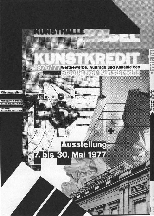
"Kunstkredit Basel 1976/77" Worldformatposter for Kunsthalle Basel, film layering, 1977
In this image one can see that such image is in a grayscale tones and also have a photomontage look. Their is a also the use of typography, with different variety of font sizes all in sans serif style.


"Kunstkredit Basel 1980/81," Worldformatposter for Kunsthalle Basel, 1981   
Once again, the designer made use of bold suns serif fonts with different sizes. It seems that their is used some sort of the grid system together with geometrical shapes and shades of bright colours. It is also asymmetrical layout in a simplicity way, at the same time there is a "modern" look to it.


Reference

Livingston, A. I., 2003. Graphic Design and Designers. London: The Thames & Hudson.